I must have started drawing around 1995. As I recall, it was partly because I wanted to try my hand at making web buttons. (My first home page was in Feb 1995.) The desire to have images for roleplaying game webpages was the primary impetus that forced me to draw a few more things that year. Next I was modifying photos for rpgs and even trying the occasional drawing from scratch. This habit snowballed into a serious Photoshop addiction. I strongly believe that the modifying of scans (trying my darndest to keep them looking photographically realistic) was crucial to what I can do now.For an idea of what I was drawing back then, take a look at the Hydra roleplaying game page. (I did not do the way-cool silvery hydra beast on the top page.) Particularly, have a look at the Rogues Gallery pictures. I did many of them. I did things like changing eye color, hair color, etc. After a while I could do things like in my Mythical Creatures gallery. The demons came even later.
I use the airbrush mostly these days. I started with the paintbrush though, at about a 6-12% opacity. I used to use the airbrush at about that opacity too, maybe 12-18% but now that I'm more experienced and have a pressure sensitive tablet, I'm using about a 50% opacity airbrush.
I draw with volumes and carve away excess with the eraser. Not lines and fill in the way I think most people draw naturally. I started doing the volumes thing a couple of years ago when a friend of mine who took an art class said that's what she was taught. It takes some getting used to but helps me.
As for colors, I tend to draw in muted colors, usually on black. At some point when the picture starts to please me, I use the hue-saturation dialog box to brighten and enliven it. It used to be that more often than not, I'd turn the picture mostly-blue but I'm learning to wean myself from that color. ;-) Then, I'll often turn the "keep layer transparency" checkbox on then airbrush the colors that I like over that part of the image. With the airbrush mode set to "color" you don't smoosh or mess up any details or lines, you just change color. Pretty cool. I also really like the dodge and burn tools, they're great for making things look 3d, and making highlights really shine.
If you have a specific question, I can answer much more coherently. Feel free to ask me.
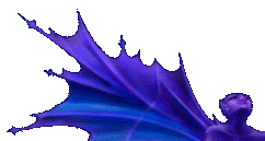
Someone: Yes, I do have a specific question. *s* somewhere. How do you get the hues of the blue you use to match so well? And how do you get it to deepen into the right shade of purple? Meilin: Um, are you using layers? If you're using layers (Photoshop 3+) or drawing on black (Photoshop 2), you can use the eyedropper to pick up some of the blue you like, and lightly airbrush the blue/purple boundary with the "paint with color" (or whatever it's called) option.
But usually, I draw in a fairly neutral color, and if I like it, I go to the "hue/saturation" dialogbox, up the saturation until I like it and fiddle with the "hue" slider. That gets me to the basic color scheme and then I do that airbrush with color or other things from there.
I don't know about "right shade" of purple. I'm not too picky usually, I just fiddle with the hue slider until I like it. Distressingly often it ends up somewhere in that blue-purple range ;-)
And now you know why most of my pictures are on black backgrounds :-)
|
Main Gallery . . .
Home
|